- ENCANTO KITCHEN -
- Falmouth uni - Y2 - environment art - First term project -
The final submission for my second year, first term, environment class for Falmouth Uni. We were given a brief to create an environment from a movie or tv show. I decided on the kitchen from Encanto, as I loved its level of detail, and its 'organized chaos' look. I modelled everything in Maya, textured in Substance Painter and Substance Designer, and set it up in UE5. The project went well overall but suffered from bad UVs and lighting. I wanted to break down my thought process here, and explain its shortcomings.
This project ended up taking quite a long time due to its large number of different assets and textures. At this point in my learning process I was not as efficient as I am today, and it meant a lot of time was taken up through unnecessary time sinks. However, as I said I picked this environment as I’ve always liked very busy environments that had tons of detail. I think I had some great assets here with some clean textures, that in the right lighting look wonderful. The kitchen most of all had a lot of work put into density and the small candles littered around make for a cosy scene, which is what I was after. However this project did highlight some personal shortcomings as an environment artist that I have worked on since. Most namely, lighting, texturing and UV unwrapping.
Reference photos
These, plus some others made up the reference photos that I used to map out exactly how the kitchen is laid out. The piece to the right is what I used as the primary reference, as it clearly laid out the kitchen, plus gave me a ton of ideas for assets I could populate the scene with. As you can see (or maybe not because of the lighting) I was able to match these photos quite well. The full extent of my reference photos was a filled PureRef file, with some additional references of Colombian colonial style houses, such as the last two references. These helped get a feel for the architecture of the region Encanto is set in.
TAKEAWAYS AND THINGS I LEARNED
Lighting
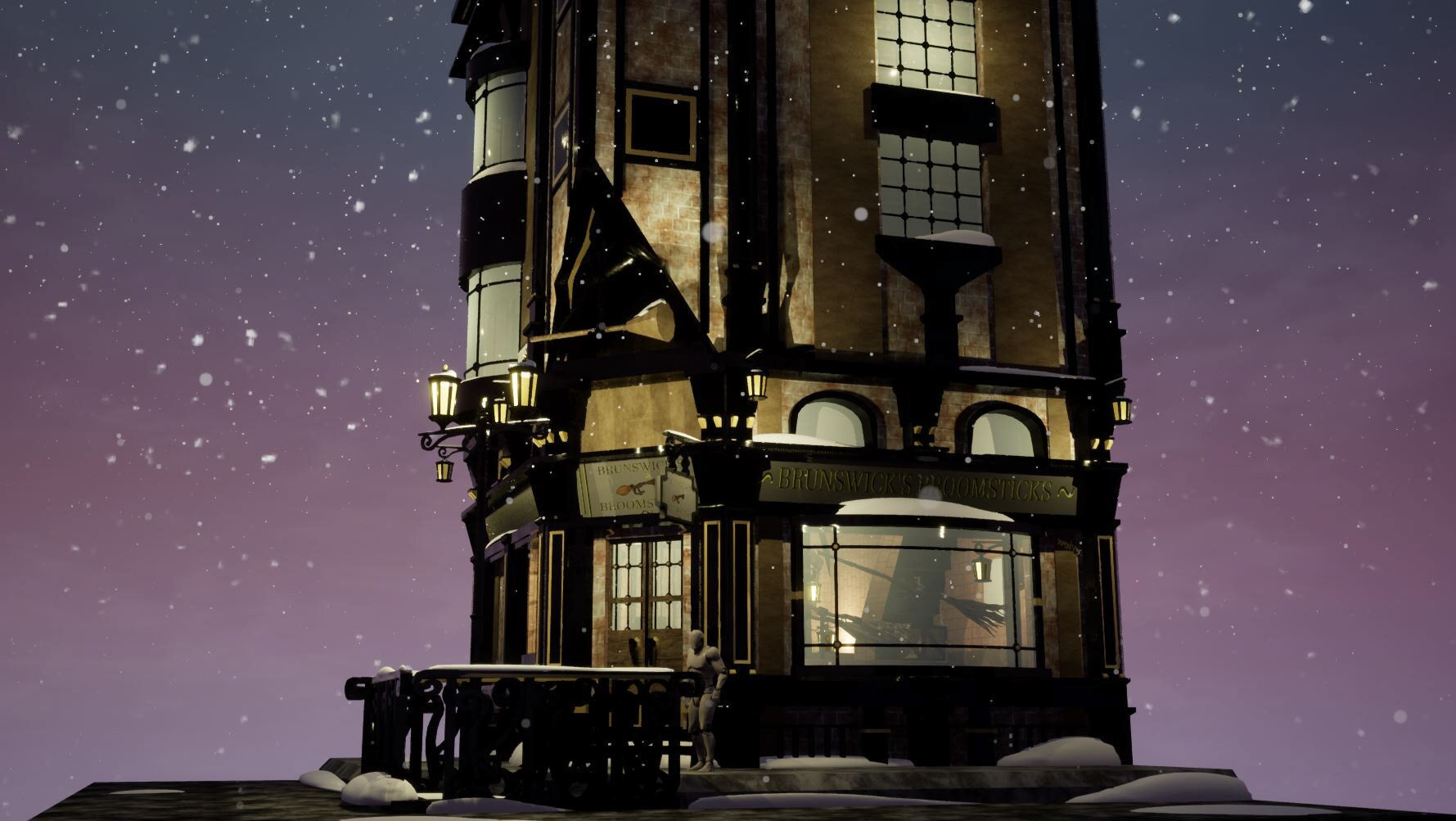
As is pretty obvious, this scene is dark. Way too dark. To the point that for my final hand in, I decided to bake an alternate version without the roof! At that time I had no idea how to properly balance a scenes lighting composition. I wanted to make the kitchen in a night scene from the start, as I felt the lower lighting paired with candles, lanterns and small fires within the scene would make for a cosy atmosphere, something that I hadn’t done before properly. A previous project, Brunswick’s Broomsticks, had used nighttime lighting, but I had used a custom day/night skybox that brightened the scene unnaturally, to its benefit. I wasn’t aware of this, so this scenes lighting confused me. I have since researched how to properly light a scene in UE5 to reach a greater balance in the scene.
With the objects under clearer lighting, the other shortcoming becomes more apparent; The inconsistent UVs of this scene...
UVs
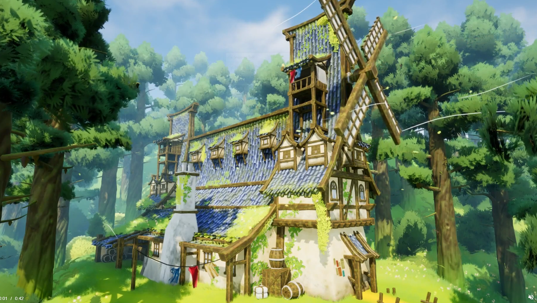
With full lighting some issues with UVs become clear. Some of the textures appear surprisingly low resolution, despite being high quality for the asset size, and there are clear seams in the textures. Both are direct issues stemming from bad UV work. This issue came up as I hadn't attempted to manually make UVs for assets this complex before. In my Brunswick's Broomsticks project, I had admittedly mostly used the 'Automatic UV Unwrap' tool, as at that point in my modelling career I was not confident in my ability to unwrap complex objects. I realised in this project that it was to my detriment as I was still not confident with doing so. As such I forced myself to learn during this project, which means it shows itself as clear growing pains in the UVs. Here you can see the clear seams, which leads to some bad looking textures. You can also see the rather unruly UV shells. Since this project I have managed to learn how to UV well, which is evident in Windcutter Cottage, where no seams can be seen.
Thought I'd also give a quick look at the total asset collection for the project. All next to each other its a decent amount of work for the time that I had. I also think that under direct lighting a lot of the assets hold up really quite well.
Overall, while this project had its ups, I felt this mostly served as a learning experience, as I was hoping for a cleaner final look. However I’m glad that now think about these shortcomings during future projects


